The timeless beauty of woom bikes
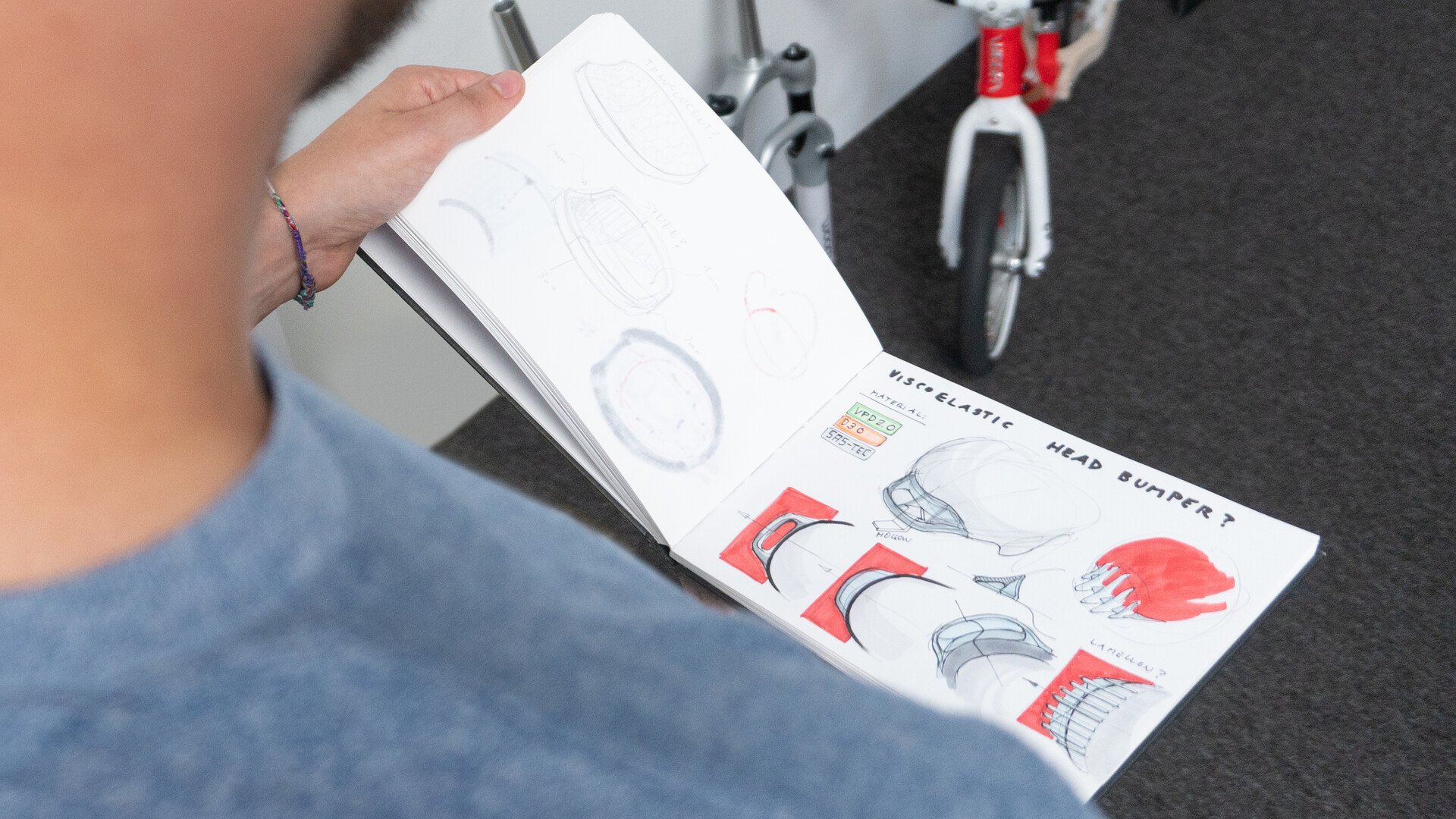
During the past few years, our products have been awarded numerous design prizes, with our ORIGINAL bikes, our helmet and our WORN TO BE WILD clothing line all receiving multiple accolades. Most recently, our new woom OFF mountain bike won the Red Dot Design Award. And to celebrate this very special occasion, we decided to have a chat with our Head of Design, Matthias Leite-Gürtner, about the design principles behind woom's products. In this interview, he offers up plenty of insight into his team's creative pursuits...
Matthias, the new woom OFF mountain bike has won three design prizes this year already. What is it that makes woom bikes so beautiful?
We always endeavour to create modern, timeless classics that are easy on the eye. woom bikes never fail to disappoint with their sleek silhouette and clean lines. They are incredibly easy to recognise. When it comes to bikes, every single component can be seen and has an important function. Barely any details can be hidden from view. They need to be pleasing to look at and yet be lightweight, stable, functional... Getting both the technology and the aesthetics spot on so we come up with a beautiful product at the end of the process is quite an art – the perfect blend of heart and mind.
What are the key design elements of a woom bike?
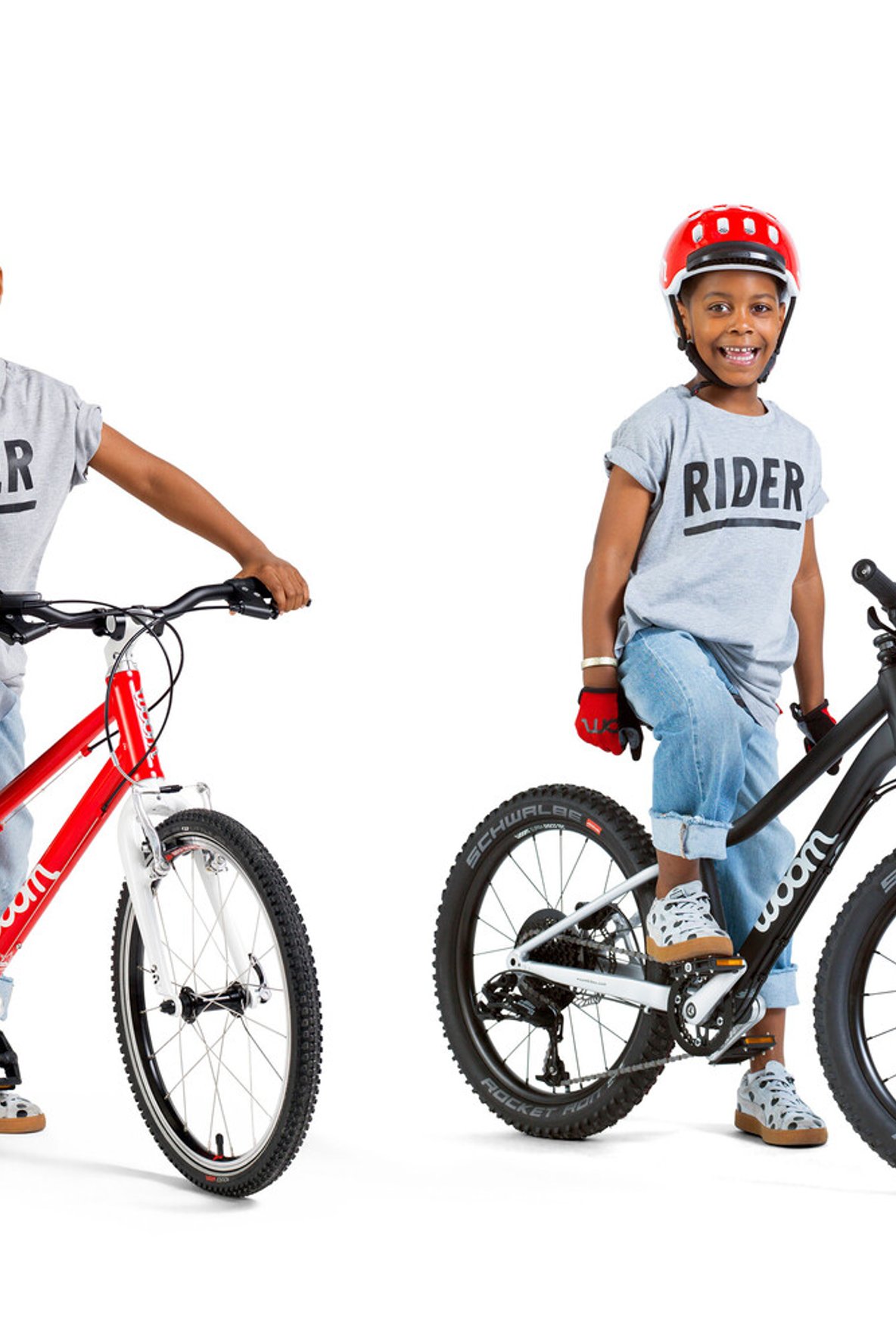
The top tube has a kink in it, whilst a different colour is used for the fork and chainstay. These simple elements make woom bikes easy to spot whether they are far in the distance or up close. All woom models have these same features – our ORIGINAL bikes, mountain bikes and even the new e-mountain bike. It's so important that people recognise our products.
Which design criteria do you follow?
In line with the Dieter Rams "less but better" approach, we don't bother with pointless frills or over-the-top design features. Let's take Porsche as an example. The basic shape of their cars has barely changed in the past 30 years and yet the design still doesn't look old or tired. The woom look doesn't have an expiry date either. And that's what you call good design. This commitment to simplicity has another effect in that the overall look isn't too busy and our products appear perfectly balanced. Just look at one of our bikes from the side. The diameters of the tubes match and the transitions are smooth.
So clean lines are important at woom?
Yes, the points at which the tubes are joined follow straight lines, with just the deliberate kink in the top tube as an exception. The contrast between the materials and components is another important design principle. For example, as I mentioned, the colour we use for the fork and chainstay is different to the colour used for the main frame. We also apply this contrasting approach to individual components like the handlebars and the stem. The striking contrasts make the bikes more vibrant and deliberately draw the eye to specific parts.
What's your approach to the use of materials for the bikes?
For us, honesty is key. We are always upfront about the materials we use. If a component is made of high-grade aluminium, we show that off. The crank is a good example of this. And if another component is made of plastic because that's the best material for the job, we don't cover it up with a sticker or try to pass it off as a different material.
The clever features of woom bikes are noteworthy too, aren't they?
Our bike models for little ones feature a green brake lever for the rear brake to make it easier for kids to find the most important brake. Our helmet comes with a visor that provides protection from the sun's rays as well as cushioning in the event of an accident. You need to take a closer look at our products to spot all of these clever details, as they often get missed at first glance. And we can't forget that our products are made for children. Our motto is "Think like a child, act like a pro", so we need to keep things funny and a little playful too. For example, there's a little picture of a monkey on our woom OFF mountain bikes and our ORIGINAL bikes say “Mozart, not Kangaroos" alongside “Designed with love in Austria”.
How long does it take to get from an initial concept to the finished bike product?
For a product line featuring multiple sizes, at least 18 months pass between sketching the initial design to seeing the finished bike for sale. Nothing is left to chance by our 15-strong development team. Every last detail is the result of countless discussions and considerations along with a lot of time, passion and dedication. And we couldn't do what we do without the feedback and visionary thinking of our CEO Christian Bezdeka. After all, he is a designer himself and the original inventor of the woom design principles.
What inspires you as a designer?
As designers, we are always on the lookout for inspiration everywhere we go. We have our eyes peeled constantly as we make our way through the world – without a minute's rest. We aim to be the most popular brand on the planet for children's bikes. We have so much planned that there's no chance of us getting bored any time soon.
Thank you Matthias for taking the time to talk to us today!
Which features of our woom creations do you love most? Drop us a line or comment on this blog post below. We would love to hear from you!
Matthias Leite-Gürtner studied Industrial Design at the FH Joanneum University of Applied Sciences in Graz. He joined the woom family back in 2015 and has been heading up the product design team since 2018.
